Consider it mood-maxxing for your home: why we're craving color again, and what six very different shades can bring to the kitchen.
If you've had your "colors done" recently, you know how strange it is to watch one tiny swatch wake up your entire face while another makes you look as if you haven't slept since Tuesday.

Seasonal color analysis became a social-media phenomenon because it gave people language for something they already felt: there is no such thing as simply "wearing blue." There is powder blue, cobalt, slate, cornflower, teal, navy. One might make you glow. Another might make you disappear.
The same thing happens in a room.
The right color does more than coordinate with the countertop. It changes how the light moves, how warm the wood feels, what catches your eye first, and whether the kitchen reads as crisp, calm, social, serious, or entirely your own.
Which is why a good designer will usually ask how you want the kitchen to feel before asking which finish you like.
Why are we craving color again?
For years, the kitchen defaulted to white, gray, greige, and pale wood. These kitchens photographed beautifully, appealed to a broad audience, and looked reassuringly "finished." Eventually, though, so many homes began speaking the same visual language that they stopped saying much about the people living in them.
Now the mood is changing.
Design magazines have called the "sad beige" era over: Homes & Gardens reports designers replacing flat beige and cool gray with warmer, more complex hues that have real depth and character. Ask designers what comes next and the answers cluster around clay, oxblood, mossy green, and softened blue—grounded, personal colors rather than another safe neutral.

That does not mean calm neutrals have vanished. Pantone chose Cloud Dancer, a soft white, as its 2026 Color of the Year, even as the runways, interiors, and social feeds filled with tomato red, butter yellow, mineral blue, and green.
It is not really a contradiction. We want calm, but we do not want blankness. We want personality, but we still have to live with it every day.
The most interesting colors right now sit somewhere between those needs. They have presence without shouting. They are soft enough to live with and distinct enough to remember.
The very short science of why tone matters

Color can affect how energetic, calm, or comfortable a room feels. Controlled studies have connected different color environments with changes in reported emotion and physiological arousal.
But hue is only the beginning.
Color also has saturation—how intense it is—and brightness. Research studying all three together found that brighter, more saturated colors generally produce more arousal, while softer, less saturated colors tend to feel quieter.
Think of saturation as the volume control. An electric lime and a dusty sage are both green, but they do not ask the same thing of a room. A soft blue may settle into the background. Cobalt will hold your attention.
Then your own memories enter the picture. The yellow from your grandmother's kitchen will not feel the same to you as it does to someone seeing it for the first time.
That mix—color, intensity, light, material, and memory—is where our new palette begins.
Six colors, six ways into the kitchen
Soft blue: colored light, brought down to earth

If you want to understand what blue can do to a space, look at the stained glass of Chartres Cathedral in France. The blue is not simply contained inside the windows. Once sunlight passes through it, the surrounding air appears to change.
Blue has been used this way across cultures: in French stained glass, blue-and-white Delft tile from the Netherlands, painted Portuguese ceramics, and the cobalt and blue-green zellige of Morocco. It is a color closely tied to light, water, sky, and handcrafted surface.
Our blue brings that history into a quieter register. It is softer and more atmospheric than cobalt, with enough restraint to work across an entire kitchen.

That puts it directly in step with the soft, chalky blues arriving in 2026 kitchens. Livingetc reports designers tipping "icy" and powder blues to replace sage green on cabinetry, praising how they pair with warm wood and the neutrals already in many homes—while a saturated cobalt does the opposite, declaring itself the focal point of the room.
In a kitchen, soft blue can make oak feel warmer, creamy stone look clearer, and an otherwise neutral palette feel more personal. It can cover the full perimeter without taking over, or bring a measured amount of color to an island, coffee bar, or pantry.
Its next chapter feels less "coastal kitchen" and more collected interior: blue with walnut, blue with warm white, blue with aged brass, or blue beside an unexpected note of red.
Warm yellow: sunshine without the glare

Yellow is moving through fashion and interiors almost exactly the way seasonal color does: not as one universal shade, but as a softer, more flattering version of itself.
Butter yellow has already traveled from the runways of Louis Vuitton, Chanel, and Chloé into furniture, wallpaper, and cabinetry. Vogue Scandinavia reports designers using it as an almost-neutral, particularly in rooms that need warmth without a heavy or overpowering color.
Its design history reaches much farther back. You can find yellow and ochre across the façades of Provence, in traditional Swedish painted interiors, in Copenhagen kitchens, and in the saffron-toned cabinetry turning up in design magazines now.
Our yellow belongs to that warmer, more grounded family. It is closer to sunlight filtered through cream than to a sharp lemon yellow.
In the kitchen, that distinction matters. A softened yellow can take the place of white when white feels too sterile. It can warm a north-facing room, brighten dark wood, and make black or soapstone surfaces feel less severe.
It also plays surprisingly well with the rest of this palette. Pair it with blue for a classic combination that feels fresh again, with green for something more botanical, or with red for a kitchen that is unapologetically expressive.
Yellow is no longer returning only as a cheerful accent. We see it moving into full cabinet runs, tall pantry walls, and tonal kitchens where several creamy shades are layered together.
Deep green: the heritage color that keeps evolving

Green already feels at home in a kitchen because so many kitchen materials speak its language: wood, stone, herbs, vegetables, garden views.
Deep olive and mossy greens have a particularly strong relationship with British interiors. They appear in English country kitchens, painted Shaker cabinetry, boot rooms, libraries, and historic homes where the color feels as established as the architecture.
But green is becoming less geographically or stylistically specific. It is no longer limited to the cottage kitchen. Livingetc's designers point to deeper olives and more complex greens replacing the predictable sage palette, used now with contemporary cabinetry, stainless steel, dusty terracotta, and richly veined stone.

Our deep green has that same flexibility. It can bring weight to a large kitchen, give an island a stronger architectural presence, or make new cabinetry feel more established within an older home.
Pair it with white oak for a lighter, more natural effect; walnut for greater depth; creamy stone for contrast; or terracotta when you want the room to feel warmer and more layered.
The future of green in the kitchen is less about bringing "the outdoors in" and more about treating green as a true foundational color—one that can be traditional, modern, tailored, or relaxed depending on everything around it.
Warm neutral: beige, with evidence of life

A neutral does not have to disappear.
The warm neutrals gaining ground now take their cues from physical materials: limestone, plaster, sand, mushroom, oat, clay, and unfinished wood. Their undertones are visible. Their warmth changes throughout the day.
This color family has a long architectural life. Lime-based finishes appeared throughout Roman and Mediterranean interiors, while Morocco developed tadelakt, a polished lime plaster traditionally used across walls and architectural surfaces. These finishes never look completely flat because the material responds to light.
That texture has become newly relevant. Remodelista's guide to modern plaster tracks the return of lime, clay, and Venetian finishes, and its primer on Moroccan tadelakt shows how that warmth has moved into contemporary kitchens and baths.
For 2026, designers are replacing cool gray and stark white with plaster off-white, milled oat, mineral taupe, and chalky mushroom—the warmer neutrals Homes & Gardens says are taking beige's place: shades that still create flexibility, but bring more depth to wood, stone, and metal.
Our warm neutral is designed to do the same. It can carry an entire kitchen without feeling empty, or serve as the bridge between stronger colors. Use it above a red island, beside deep green cabinetry, or with terracotta when you want warmth without too much contrast.
It is the palette's quietest finish, but not its least considered.
Terracotta: clay moves from the floor to the cabinetry

Terracotta may be trending, but it has never been waiting for permission.
It has lived in kitchens for centuries: underfoot as tile, on shelves as pottery, and throughout the architecture of Italy, Spain, Portugal, Morocco, and Mexico. The color comes from clay itself, which gives even its stronger versions an earthiness that synthetic orange often lacks.
Now terracotta is moving upward. Livingetc recently called it the biggest kitchen cabinet color of 2026, showing it across Mediterranean, contemporary, farmhouse, and retro-inspired kitchens, and noting how naturally it sits with stone, oak, plaster, and brass.

Our terracotta is sun-warmed rather than bright orange. Its earthy undertone lets it behave almost like a neutral while still changing the character of the room.
Across full cabinetry, it can make a large kitchen feel warmer and more social. On an island or beverage station, it adds color without dictating the rest of the space. In strong natural light, it becomes brighter and more expressive. In cooler light, its brown and clay undertones become more visible.
It works especially well with creamy stone, white oak, walnut, deep green, soft blue, and warm metal finishes.
Terracotta's next move is not simply more Mediterranean kitchens. It is cleaner cabinetry, quieter materials, and contemporary spaces that use clay color without turning it into a theme.
Rich red: the color with the longest passport

Red may be the boldest finish in the palette, but it is hardly new to interiors.
Its history moves from red-ground Roman frescoes to Chinese oxblood glazes, the painted cottages of Sweden, British dining rooms, and lacquered European cabinetry. Each version carries a different mood: ceremonial, domestic, intimate, polished, or raw.
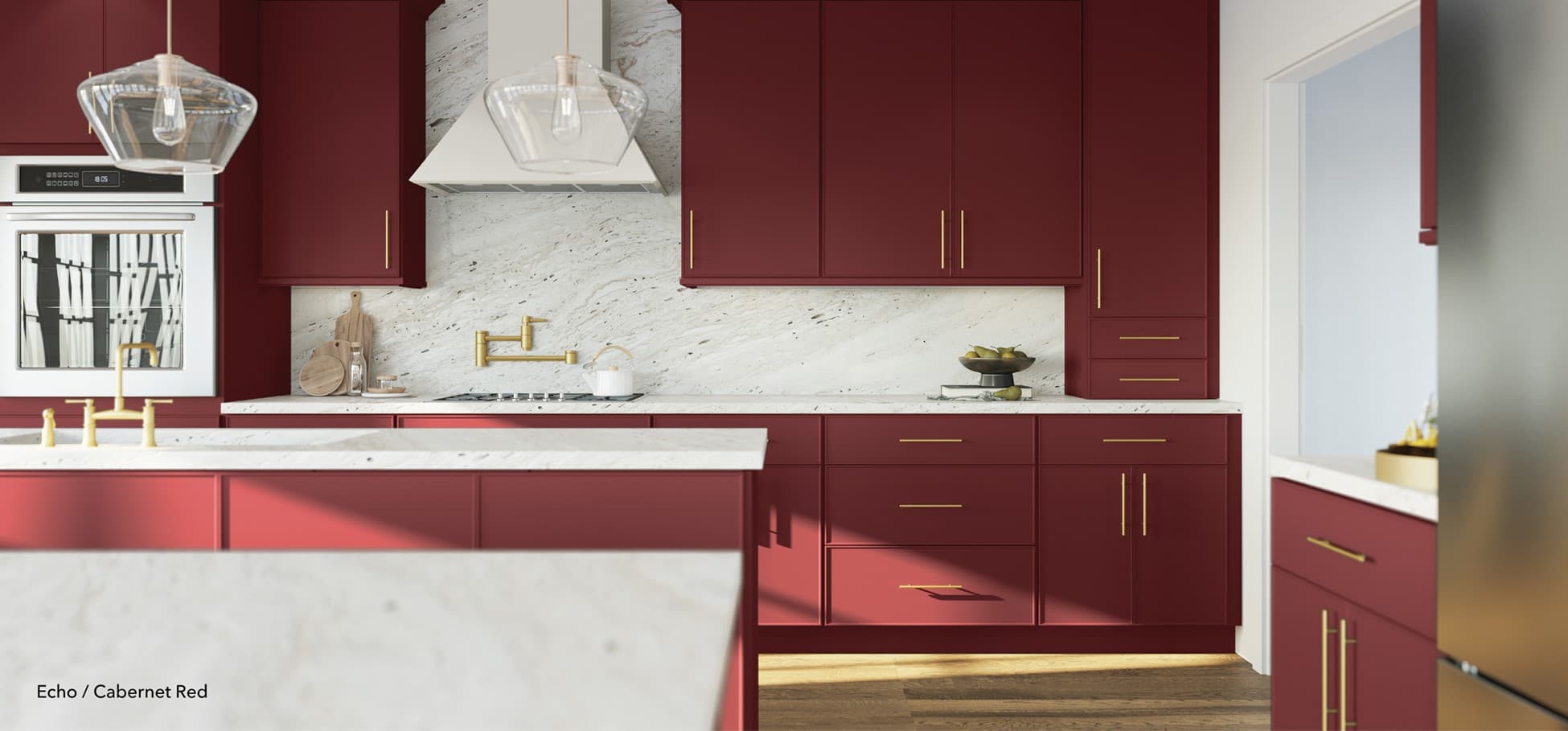
Its recent revival has centered on oxblood—a red with brown in it, warmer and more grown-up than a primary red. Livingetc calls oxblood a "sexy," sophisticated shade that cocoons a room rather than shouting at it, and designers are increasingly reaching for red to add warmth and emotional depth rather than shock value.

Our red follows that richer direction. It has more depth than a primary red and enough warmth to sit naturally beside wood and stone.
It can turn an island into the visual center of the kitchen, give lower cabinets more presence, or wrap a smaller pantry or bar in color. Paired with warm neutral, it feels composed. With pale blue, it becomes unexpected and editorial. With walnut, aged brass, or veined stone, it becomes deeper and more established.
Red is moving beyond the small "unexpected red" accent. For homeowners ready to commit, cabinetry gives it enough scale to become part of the architecture.

Six colors—not six fixed personalities
It would be easy to reduce the palette to blue for calm, yellow for happiness, green for grounding, neutral for balance, terracotta for warmth, and red for confidence.
But color is more interesting than that.
The same finish can change with the light, the room, the materials beside it, and the person looking at it. Soft blue can feel peaceful or crisp. Terracotta can feel rustic or highly contemporary. Red can energize a space or make it more intimate.
That is why these colors were developed as starting points, not instructions.
Together, they give homeowners and designers six different ways to move beyond the expected kitchen—and six more specific answers to the question that should begin every design:

How do you want the room to feel?
The new palette is coming soon. We'll share the finishes, pairings, and full color stories when it launches.